Informative Resting Place

Well, I guess I needn’t have agonised over the universality or otherwise of the word “info” in the last post because an italic letter “i” is probably all that’s needed for most situations. Yes, the connection is tourist/public information points, “info” or “i”.
Having said that of course, the letter “i” appears to have been appropriated by the information technology industry, particularly in relation to a certain brand of mobile phone. Before that, I suppose the car industry owned it in terms of denoting a car with fuel injection, eg GTI, TDI etc. (There’s nothing special about fuel injection these days though.)
Anyway, such current widespread use of the letter “i” as shorthand for the word “information” probably confirms its universality. The question is, for public/tourist information uses, does “i” need to be displayed in italic or standard form?
As for where the photo (slide) was taken, it’s from the public concourse at Millennium Point in Birmingham shortly after it opened in 2001; making it a true millennium project unlike some buildings etc that opened after 2001. The dual use of the tilted cube was probably appreciated by the chap leaning against it. The cube is no longer there, presumably because it was taking up too much space.
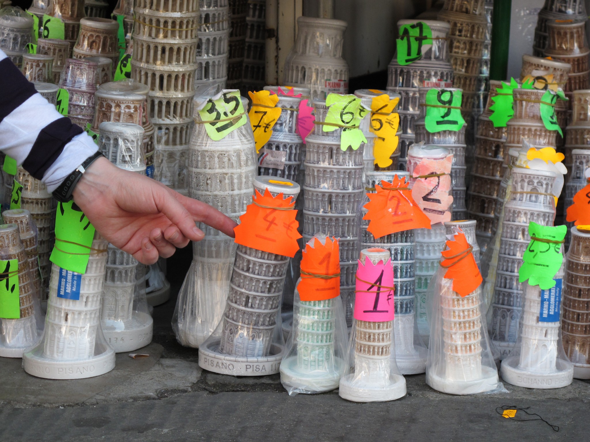
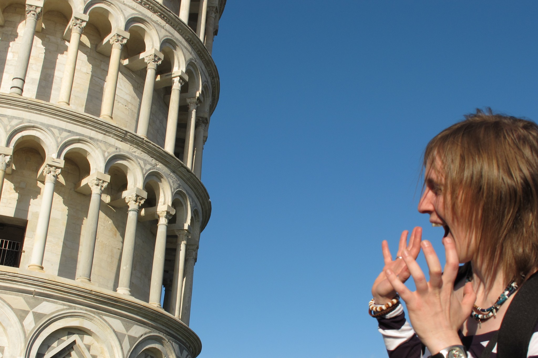
Below is another object that’s not vertical, the leaning tower of Pisa…shown with people interacting with it, in a lighthearted way. I didn’t go for the traditional “trying to hold the tower up” photo, apart from showing other people attempting it, preferring instead to show someone (Zoe) terrified that the tower is about to fall on them. Also, there’s the photo of a model of the tower being pushed to lean further than the rest of the models in the group.