
Informative Resting Place

Well, I guess I needn’t have agonised over the universality or otherwise of the word “info” in the last post because an italic letter “i” is probably all that’s needed for most situations. Yes, the connection is tourist/public information points, “info” or “i”.
Having said that of course, the letter “i” appears to have been appropriated by the information technology industry, particularly in relation to a certain brand of mobile phone. Before that, I suppose the car industry owned it in terms of denoting a car with fuel injection, eg GTI, TDI etc. (There’s nothing special about fuel injection these days though.)
Anyway, such current widespread use of the letter “i” as shorthand for the word “information” probably confirms its universality. The question is, for public/tourist information uses, does “i” need to be displayed in italic or standard form?
As for where the photo (slide) was taken, it’s from the public concourse at Millennium Point in Birmingham shortly after it opened in 2001; making it a true millennium project unlike some buildings etc that opened after 2001. The dual use of the tilted cube was probably appreciated by the chap leaning against it. The cube is no longer there, presumably because it was taking up too much space.
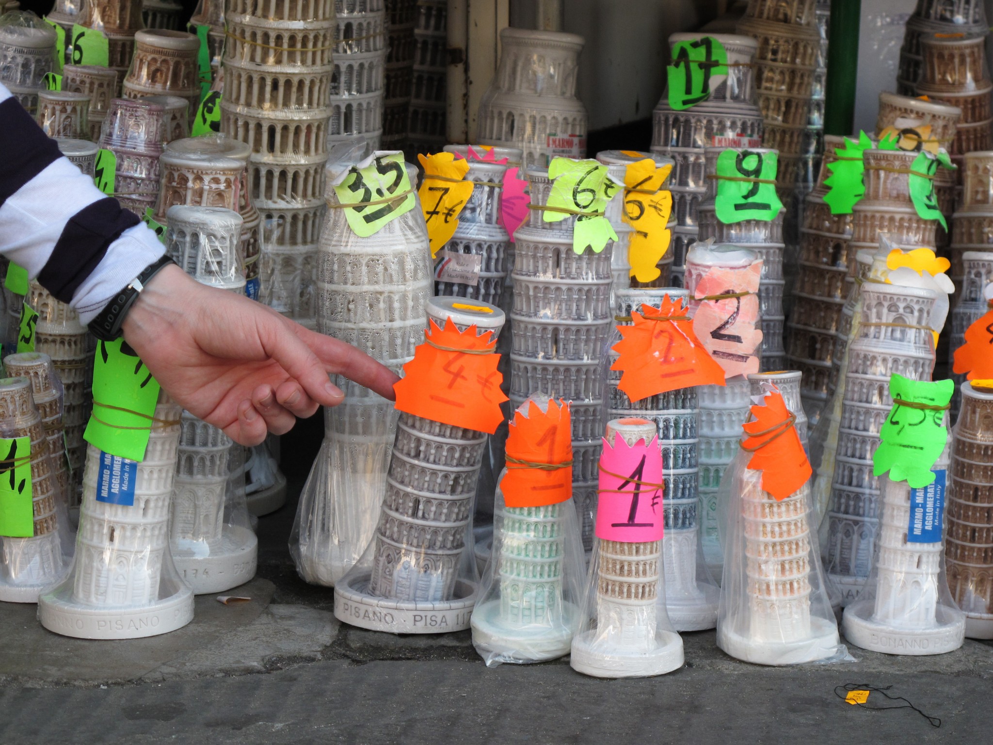
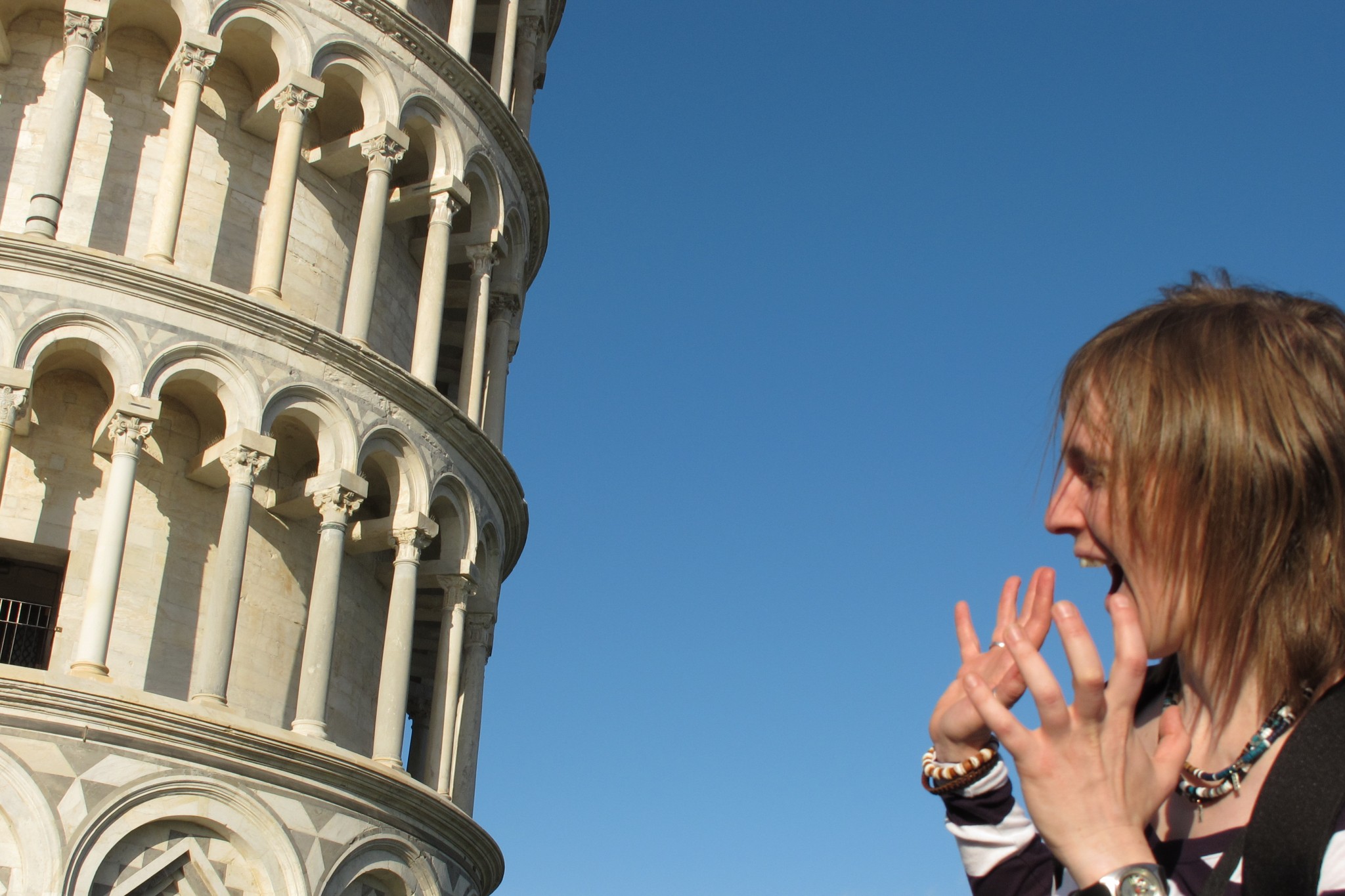
Below is another object that’s not vertical, the leaning tower of Pisa…shown with people interacting with it, in a lighthearted way. I didn’t go for the traditional “trying to hold the tower up” photo, apart from showing other people attempting it, preferring instead to show someone (Zoe) terrified that the tower is about to fall on them. Also, there’s the photo of a model of the tower being pushed to lean further than the rest of the models in the group.

Babel Fish Required?

The connection is “steps”, still in a brutalist place although here there is marble instead of concrete. This scene is from the European Parliament building in Brussels and was captured (on slide film) in June 2007, so there may well now be more languages represented on the plaques on the left of the picture.
I found it interesting that the number of plaques (not all shown) represent each main/administrative language of the member states, but there is just one signpost for the nearby information point “info”. The word “info” has probably achieved the status of being universally recognisable, although the person charged with erecting the sign for the information point could have just been thinking from a local perspective.
Like the word “info”, the words “European” and “parliament” are fairly universal so the number of plaques used could be superfluous, although it’s an interesting alternative to using flags to represent national membership of the European union. Using languages to represent membership of the union might not however be the best method because some of the many that are spoken have been omitted from the plaque-based list (eg Chinese). Perhaps language is a proxy for representing the free passage between member states that European residents from various cultures/identities have. Therefore, displaying a map of member states with boundaries between them instead might send out the wrong message of what the union is meant to be about. Use of flags however could be the best compromise in terms of showing the diversity of membership, despite the issues surrounding the use of flags as discussed so well in the song by Rush called “Territories“.
The picture, for some people, might be a good way of showing how matters associated with the European union are apparently over-complicated when simplicity is possible. Maybe however the scene is an embodiment of what the European Parliament is trying to achieve…literally right on its doorstep, ie embracing diversity and resolving differences.
As for other universal signs, here’s an example of a bird noting the direction of an emergency exit, should the need arise.

Paradise Lost (but “soon” to be re-established…again)

Paradise Place, Birmingham
Sadly the connection is nothing more challenging than “monochrome”. I considered connecting with an abstract image of boats on the water, similar to lily pads, but since the area shown above in Birmingham is being redeveloped I thought there should be a tribute to this architectural irony.
Perhaps the 1960s and 70s planners and politicians thought that such brutalist concrete modernism was exactly what the public was looking forward to, hence continuing to use the word “Paradise” in the place name; a word which has been associated with the area since medieval times. Hilarious. The “old” library in the background has already been replaced, but I’ll be sad to see the building go. I quite like the upside down wedding cake effect and it’s possible that refurbishing it at a much lower cost than building the new library would’ve been a smarter choice. After all, what are we getting instead? Less than iconic office buildings, although there will be much done to create better public spaces and some of the horrible roads in the area will be removed. So there could be an improvement, but the timescale of redevelopment, which will be completed by 2025-ish, means that people will have to put up with long term disruption in yet another area of central Birmingham. A case of Paradise postponed.
The photos below tell some of this ongoing story of change. Some of the other chapters could include the various elements of the changes, eg effects of changes to pedestrian routes, re-routed bus services, new road layouts, demolition works, construction progress, opening ceremonies, media coverage, etc.
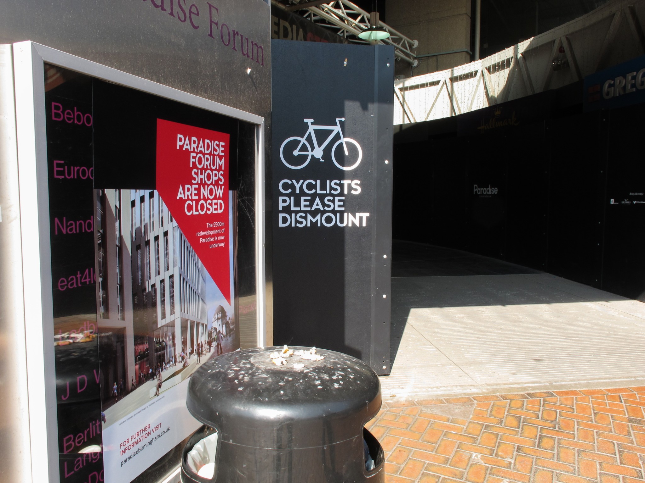
The “old” library, until recently just a thoroughfare. Now awaiting demolition. (Any late returning books should be taken to the new library.)

Information about the changes and the pedestrian thoroughfare. No scheme completion dates mentioned, just the money being spent on it.
It’s currently a more pleasant to get around on foot and bicycle because the nearby roads, on what would normally be one of Birmingham’s main traffic clogged arteries, have been closed to motor traffic.
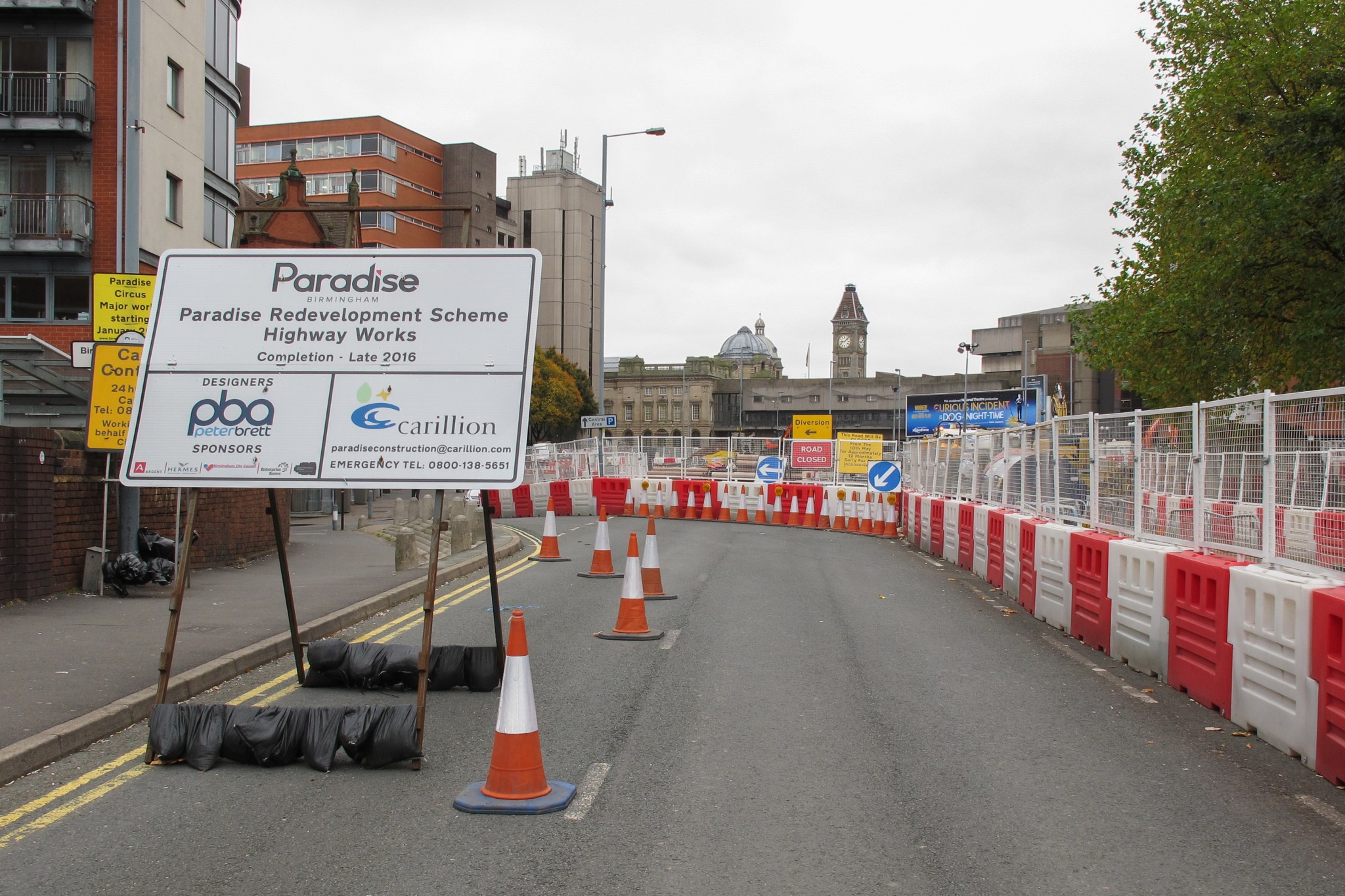
There is however a lot going on to create a new road junction.
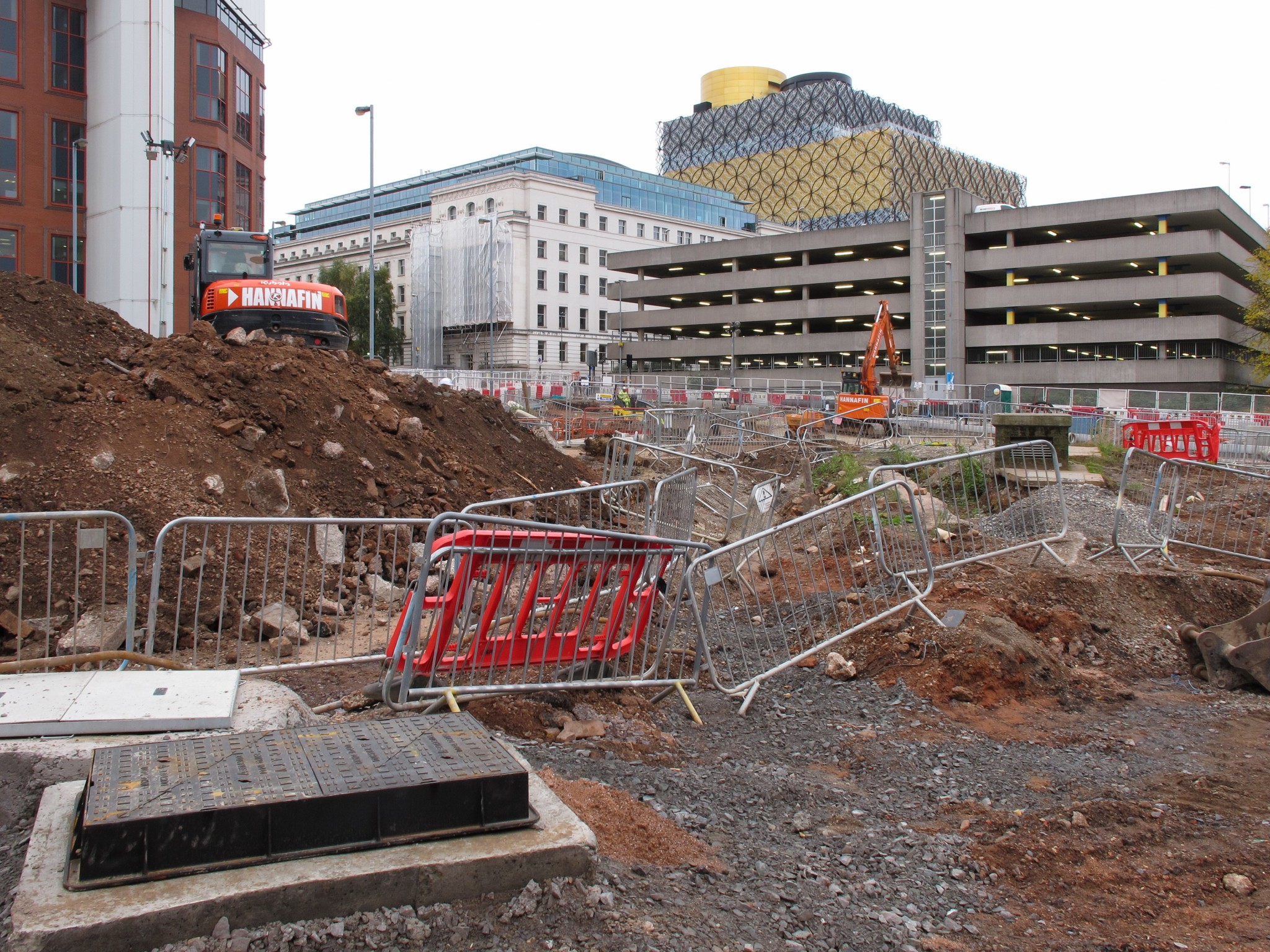
The “old” and “new” libraries (left and right), with Alpha tower in the middle. When will Beta and Gamma towers be completed?

Lily Pad Leaves

The connection is “leaves”, this time waterborne ones rather than leaves from trees…although of course many of these end up in water. Anyway, you know what I mean!
This is a collection I’ve had hanging around for a few years but haven’t done much with, mostly because the fast black and white film (Ilford 3200) I’d used (in daylight because I thought the results might be interesting) hadn’t been particularly well developed and the images had a lot of strange spots over them. Using Photoshop to sort this out would’ve driven me up the wall but thankfully I now have Lightroom, which is much easier use for “cloning” and “healing”. It’s also easier for the purposes of adjusting contrast, exposure settings and adding even more grain…or removing it. Anyway, here are some more. By the way, they’re from Thimblemill Pool near Bearwood in the West Midlands.


Next time there’ll be more monochrome. It’s the only connection I can think of at the moment…apart from the obvious “water” option. More “leaves” would go against my constantly evolving self-imposed rules for this photo-connection series.
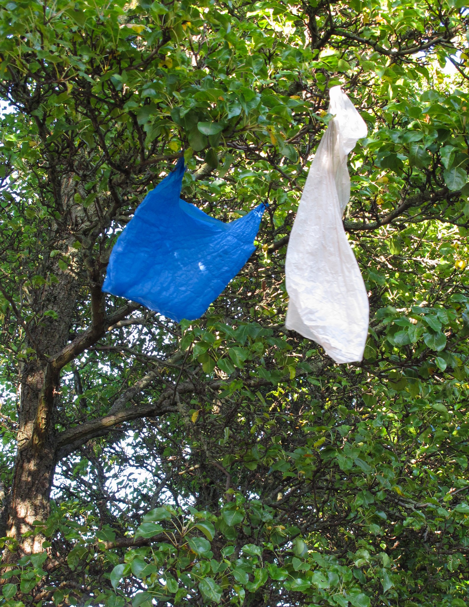
Endangered Species No. 16307 – The Plastic Bag Bird

The connection is “bags”, although the one here is of the less substantial sort whereas (most of) the tourists were carrying something more robust. I’m not aware that the World Wide Fund for Nature is interested, but the plastic bag bird, also known as the bird that doesn’t fly south for the winter, is becoming less numerous. The images below show a range of habitats in which they can normally be found, although to a reducing extent.
Evidence of the existence of plastic bag birds usually becomes clearer during autumn because as trees shed leaves they can still be seen clinging to branches. As the years pass however, I can see them becoming an endangered species (currently numbering 16306) as they biodegrade and are not replaced by others. This is due to the imposition of a recent tax which has been designed to reduce their numbers.
The semi-permanence of their existence in trees can cause anxiety amongst people who live near them because they usually find them unattractive. The birds are regarded as a nuisance, although eventually they leave, and of course they can be obscured by foliage in the summer months.

Another problem with their continuation as a species, is difficulty with mating. The blue bird shown here trying to move towards the white bird is unable to disconnect itself from the branch and move closer to it.
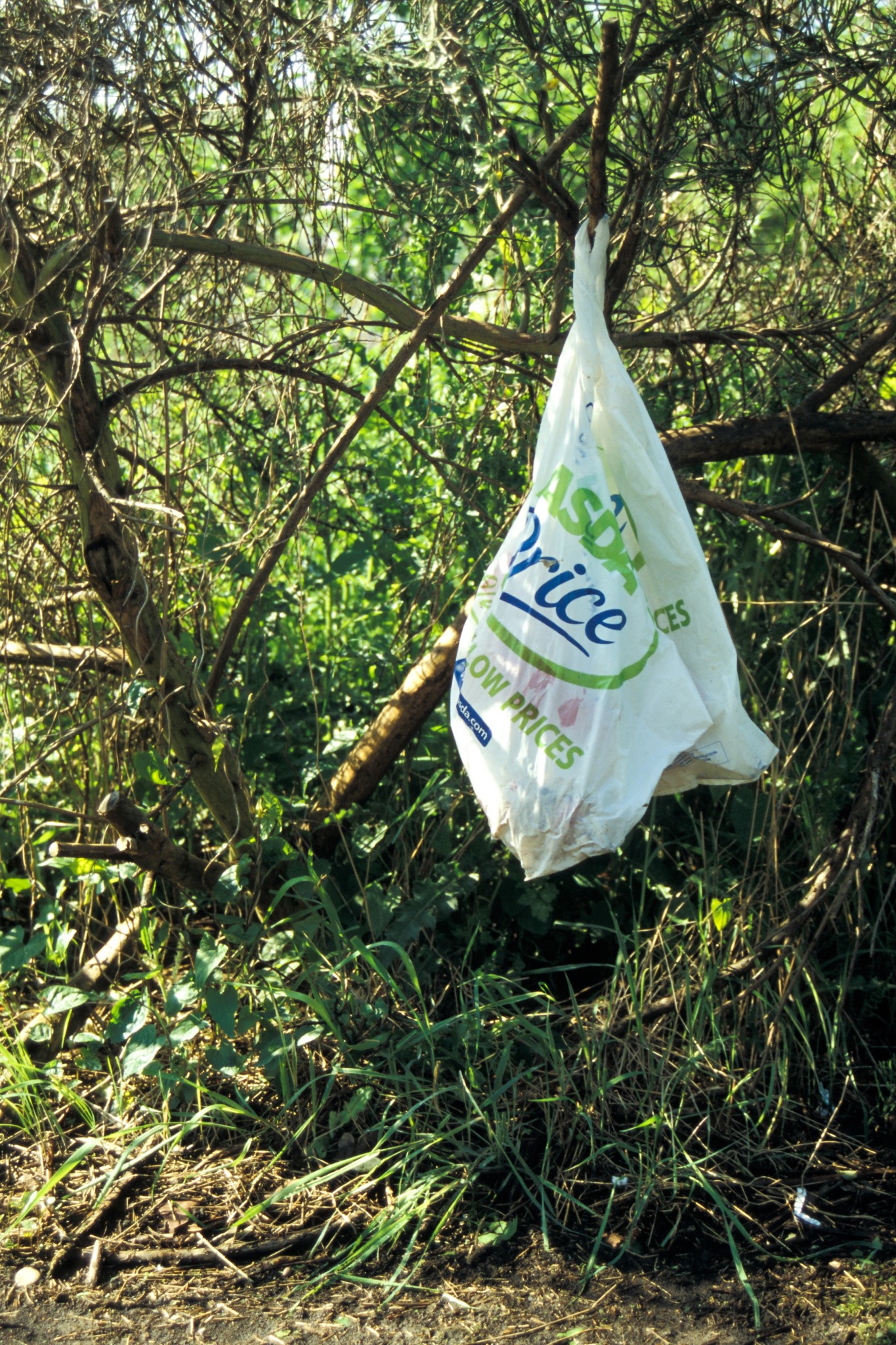
Some can be found closer to the ground in bushes, as shown in this archive photo from May 2006. One very interesting aspect of the plastic bag bird is the ability to evolve its plumage over the period of a few years. Observers would now see different markings on the one below, but some elements of the pattern would confirm its membership to a particular sub-species. One thing that doesn’t appear to endanger the existence of plastic bag birds is their inability to blend in with their surroundings, although as noted above, they can successfully remain obscured by leaves during summer months.
Some sub-species are very mobile and usually ground-dwelling, although they too seem to be declining in numbers.

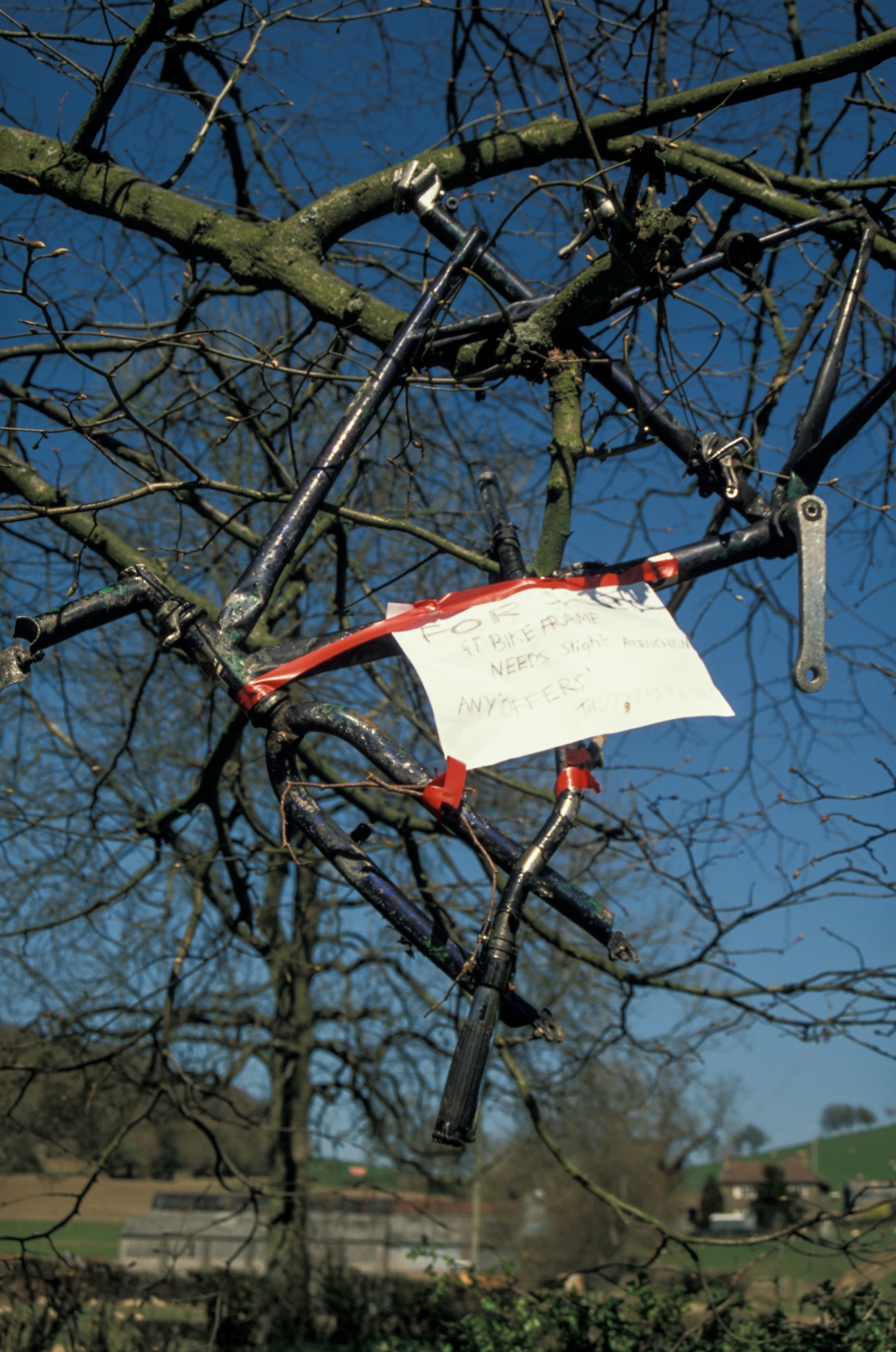
As for what is likely to take the place of plastic bag birds in trees and be visible during the winter months, there is no certainty. A sturdier and more substantial species has been spotted on occasion as shown below.
Despite the declining numbers of plastic bag birds, there is a worrying and less visible increase in the amount of plastic bag plankton in the world’s seas. It is unclear as yet whether or not this can be taxed out of existence.
Temporal Triptych

The connection is “tourists”…in a slightly busier place and, I suppose, on block paving again. The three photos are from Antwerp Market Square and, according to the photo metadata, taken about 10 seconds apart.
I thought a triptych would be a good illustration of how tourists can be gripped by the sight of something for a short time, having just arrived there, after which they turn their attention to other parts of the scene around them. I don’t know if 10 seconds in such a situation is a typical period over which tourists pay full attention to something before they are distracted, get bored or simply want to look around. A psychologist must have studied this. It will depend on the scene/subject of course.
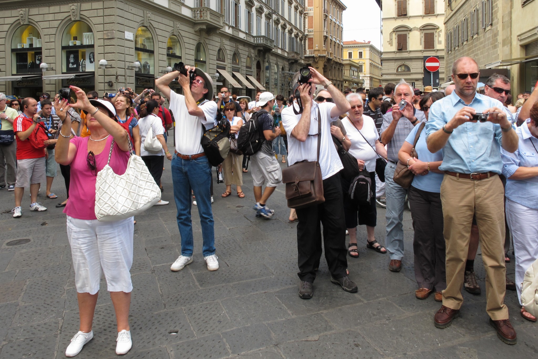
I liked the fact that in the photo above the people aren’t recording the scene with cameras en masse. They seem to be genuinely taking it all in. The photo below however, from Florence, is slightly different, as if proof of visiting is needed or because visiting time is limited or there are so many other places to visit…or the scene is so amazing. Possibly the latter as it’s Florence Cathedral with the famous Duomo. The fact is the initial sight of what was behind me prompted mass photo-recording. I’m not sure if they then turned a corner to go elsewhere or if they walked closer…or went inside the cathedral and up the Duomo etc.
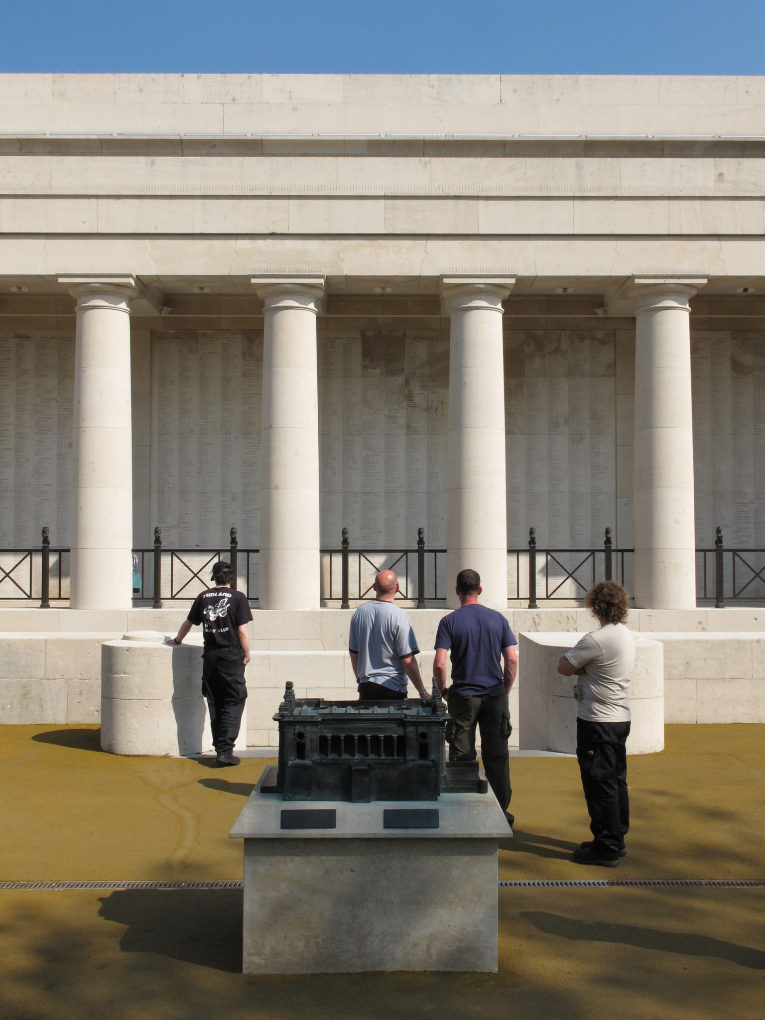
Below is another example of some people taking-in a scene together, this time the Menin Gate at Ypres. The names of fallen soldiers with no graves carved into the building is an awe-inspiring sight and, although the building is impressive in scale and construction (compare the model in the foreground to the building behind) there are clearly other things on the young men’s minds…and they didn’t move very much for some time. Although the buildings in Antwerp’s Market Square (and Florence) are impressive and ornate etc, they can’t compete in terms of attention span with the Menin Gate even though in physical terms there’s less to see at this very sad place. The triptych and the photo below seem to bear this out.
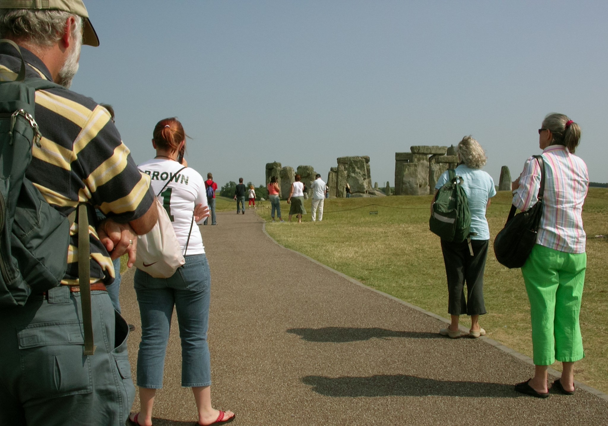
The attention span of people at tourist locations can of course be influenced. The people at Stonehenge below are listening to audio recordings describing the site and waiting for an instruction to progress to another vantage point at which further information will be imparted. Alternatively, if they were friends of mine, they’d be wondering if I’d finished taking the photo and could they get on with their visit/life!
The last photo below, a portrait of a land/seascape from the Lizard in Cornwall, suggests the sort of timelessness and freedom of doing what you want when you want when visiting somewhere that we would probably all like to achieve. The three people sat for quite sometime just taking-in the scene. In retrospect I feel a bit jealous because I invariably have a camera with me that I feel compelled to constantly record things of interest to me, meaning that I never fully relax! I might need to just sit down and look around more. Perhaps I’ll see something more interesting than the initial attention-grabbing scene/person/thing/geometric shape.

Natural Block Paving
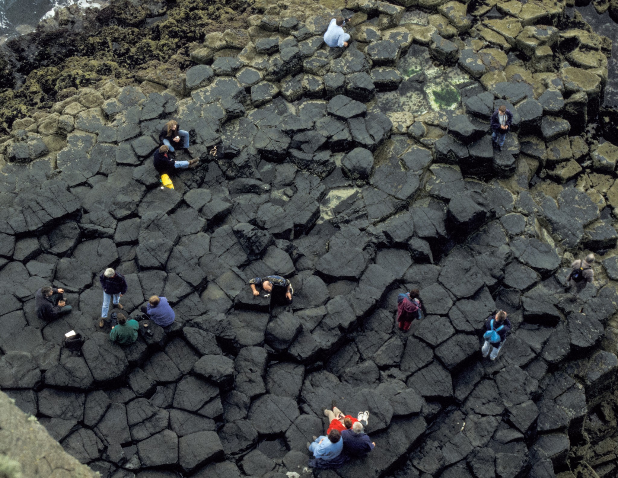
The connection is “block paving”, or at least the effect of it. It’s a bit of a tenuous link, but then the areas in each photo are used by people for walking on and the paving is fairly regularly shaped. The scene was originated on slide film in the late 1990s during a visit to the Isle of Staffa, Scotland, which of course features Fingal’s Cave.
The block paving effect is probably better at the Giant’s Causeway in Northern Ireland, with more regular hexagonal shapes, but don’t ask me why! It’s a good day out travelling to Staffa, by boat, but the Giant’s Causeway, is more accessible…despite the fact that folklore says these two areas are linked! In fact there’s lots to see in that part of Northern Ireland (where I was a student in the 1980s) and I would urge people to travel the length of the Antrim coastline.
Most people on my trip to Staffa stayed on the lower levels near to the sea and of course ventured into Fingal’s Cave. I did this too, but also decided to climb to the top of a cliff (easy enough because the island slopes up to the cliff from one end) to see if I could get an aerial photo of the rock formation. The only difficult part was achieving all this in the one hour allowed ashore. On a tourist trip in the late 1990s such an aerial photo would always feature people, but I suppose I could now clone them out! I’ve cropped the photo a bit simply because it helps with the composition….something which I couldn’t achieve precisely whilst leaning quite far over the cliff edge with the camera held in my outstretched hand. The presence of vegetation in the bottom left hand corner is testament to the fact that I need a longer arm…although a monopod would’ve helped…which I don’t own. I could clone it out, but I won’t because it reminds me of the fact that I nearly didn’t make it to the next part of the boat trip!
Since this was taken around 20 years ago, I wonder if the behaviour of the tourists seen here would be different nowadays? The chap taking the photo, probably using the camera in self-timer mode, might have a selfie-stick instead. If there’s a phone signal in this remote area, people would probably be checking Facebook and Twitter etc. Perhaps that’s the advantage of going to the Giant’s Causeway instead.
Strictly Walking
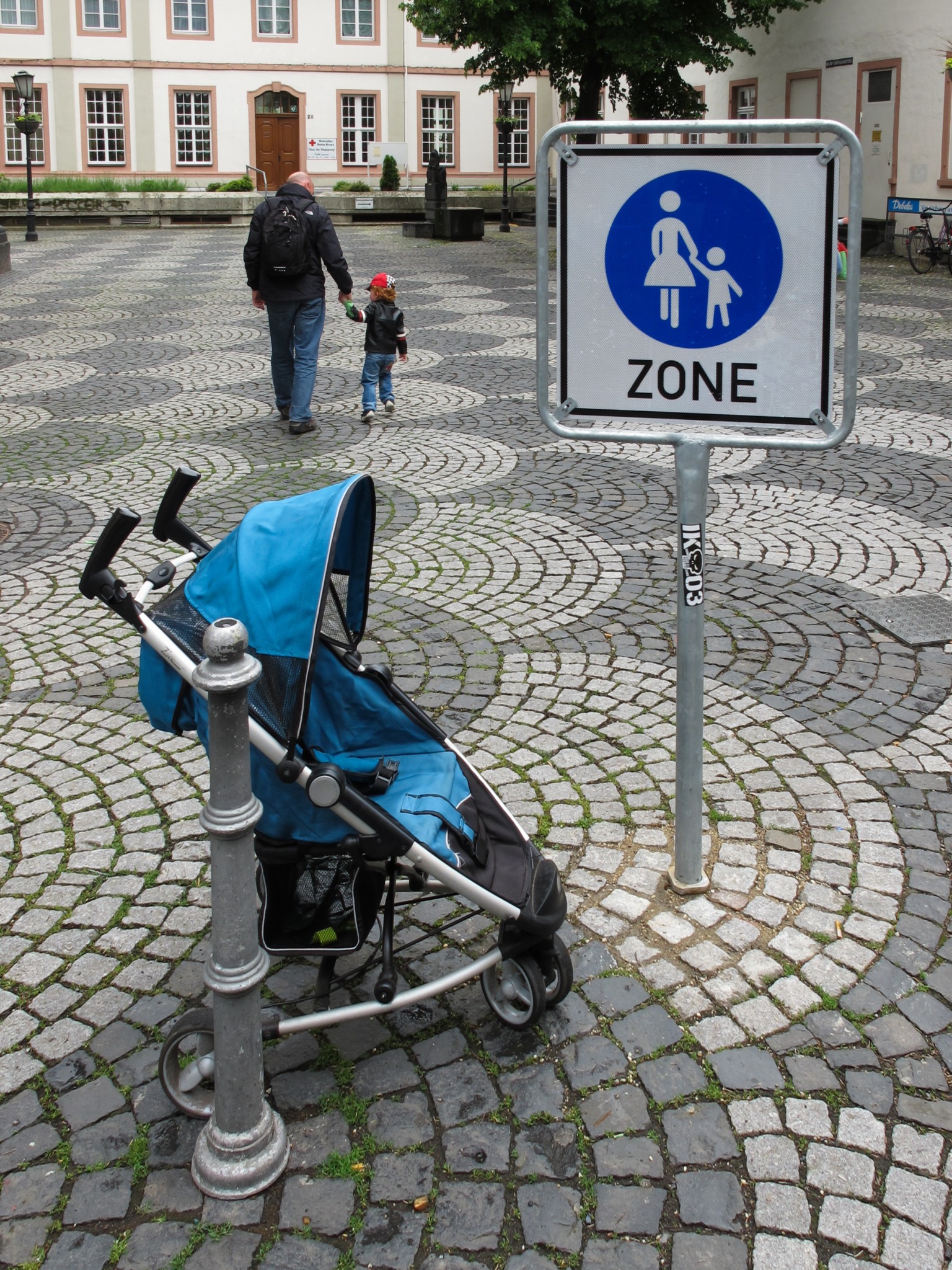
On second thoughts, the sign is suggesting that small children should be closely supervised by adults presumably because other forms of getting around are also allowed in this space, or rather “shared space“. By the way, the connection is child buggies. This deliberate attempt at humour involves a friend (Chad) walking with his son (Alex) in the city of Koblenz, Germany.
I never quite got to the bottom of the reason why this type of sign exists, but it’s likely that although the space looks like it should be a strictly pedestrianised area, it must sometimes carry motor traffic or fast moving bicycles. Shame. Shared spaces rarely serve the potential range of possible users very well and instead traffic should be fully removed. Having said that, bicycle traffic should be allowed, either along a specific route through the area that satisfies a distinct desire line, or anywhere within the area as long as cyclists understand their obligation to behave responsibly (an initiative in a Spanish city managed to improve this by targeting teenagers). Pedestrians rarely use desire lines across such shared spaces, which is interesting because people who plan them assume that they will enable walking anywhere and indeed reduce walking distances. The mistrust over the apparent withdrawal of motor vehicle priority is usually a factor. Perhaps there is a tiny bit of over-protection by the “authorities” implied by the sign, or an acceptance that the shared space concept doesn’t work in practice at this location. Also, judging by the icon on the sign, it appears that mothers are the best option for child supervision at this location. Perhaps there are “father and child” zones elsewhere.
Another problem with the space is the seemingly random positioning of the sign in the middle of the space, which could be a problem for visually impaired people. Indeed, where are the warnings for such people to not wander into the middle of this space; that at a moments notice could revert from being an apparently safe environment for pedestrians to a lethal place inhabited by dangerous projectiles.
I don’t want to be too critical of this space and the strange signage however, Germany is good at providing a good choice of facilities for people on the move, ie pedestrians, cyclists, public transport users etc, and for protecting the rights of vulnerable road users when they’re hit by the less vulnerable, eg car hitting a bike.
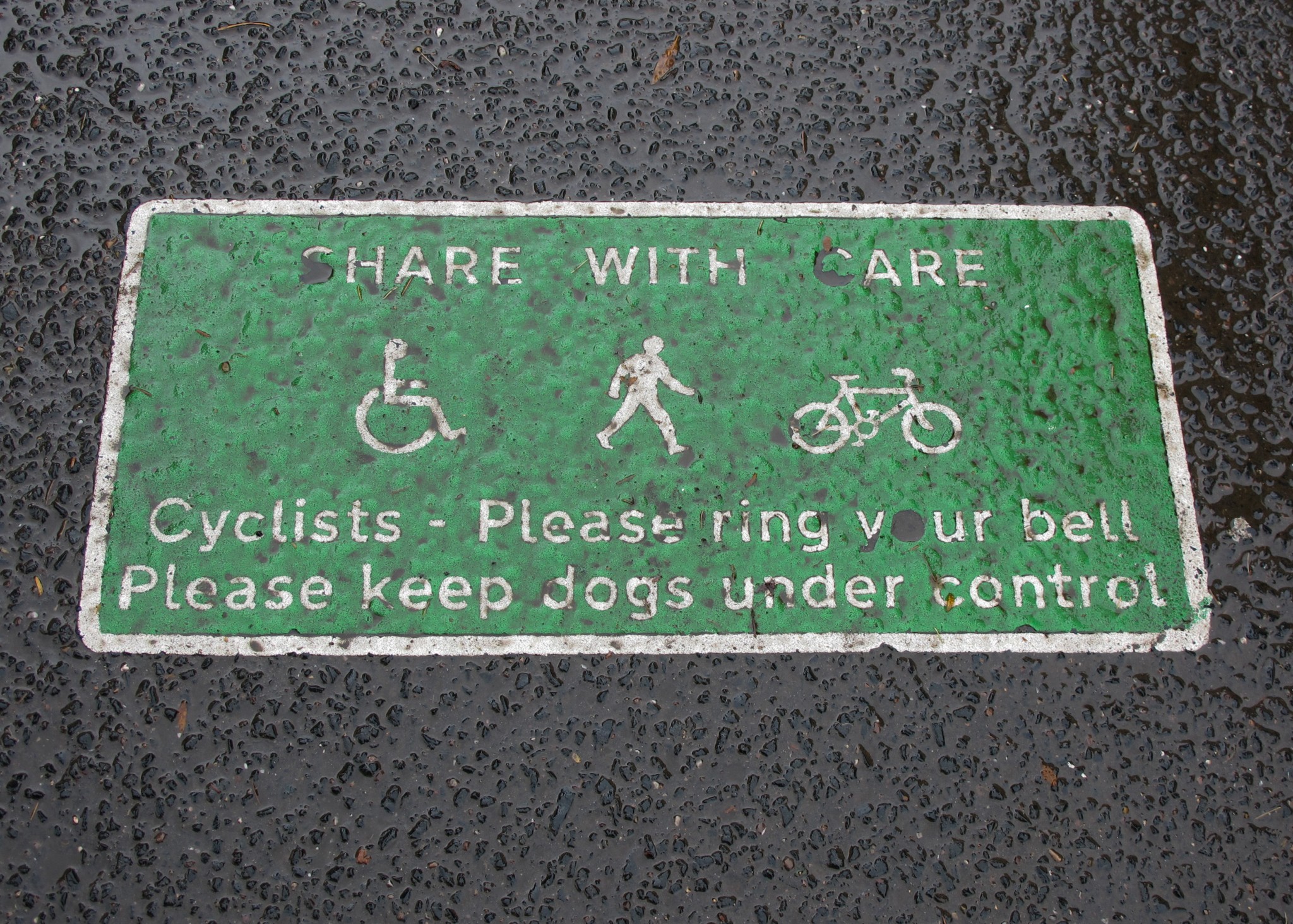
Perhaps a sign reminding the less vulnerable users of their obligations would be a better way to approach ensuring child safety in pedestrianised areas of Koblenz. A “Share with Care” message, like the one below in Cannon Hill Park in Birmingham, would suggest that children and others could wander more freely and the message would be a lot less condescending (or indeed gender limiting). Communicating this message to those who are likely to be travelling faster should be part of an education process about how highways and public spaces should be used. The Koblenz sign suggests nothing can be done so “hold on to your kids…and make sure that you keep your wits about you!” (Perhaps someone can enlighten me about the reason for using such signs in Germany…and render the above suppositions meaningless?)
Back in the land of child buggies, there is an issue about where and how they can be used on buses. The space nearest the bus entrance with no seats is reserved for wheelchair users, but can also be used for child buggies as long as there’s no demand from disabled people or other people who need to sit on the fold-down seats. Buggies would need to be folded or the driver might even refuse entry if there’s no space. The photo below (of my wonderful daughter, Eira) extends the idea of the area being used by someone who isn’t yet very stable on their feet. We would of course try to sit elsewhere on the bus given the right circumstances…assuming I could get Eira to sit still for the whole journey!

Sign Overload
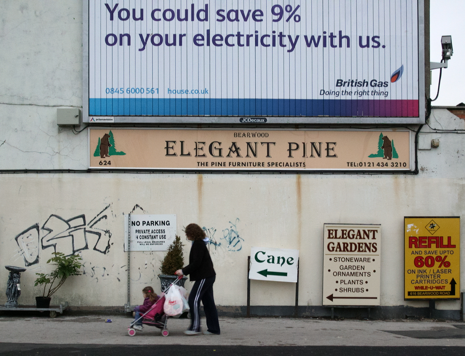
The connection, albeit slightly tenuous, is pine trees. The photo originates from 2003 taken on my old sadly departed Nikon 995, which was great for street/cowardly photography. Advert spotters will probably be able to date the scene more accurately.
I like the juxtaposition of the word “elegant” with the disorderly nature of the scene. Perhaps it should be transplanted into Dismaland. There are a number of dismal elements of the modern world in evidence: the CCTV camera, sign overload, the weirdness of British Gas being an electricity supplier, unattractive graffiti, rust streaks on the painted wall.
The passiveness of the mother and child walking past the scene reflects the commonality of these elements in built-up areas…and, if they’re local, the fact they’ve probably walked past it a few times! There are thankfully some people in local authorities whose work it is to improve the urban environment. Twelve years later the space with its new “green wall” looks like this.
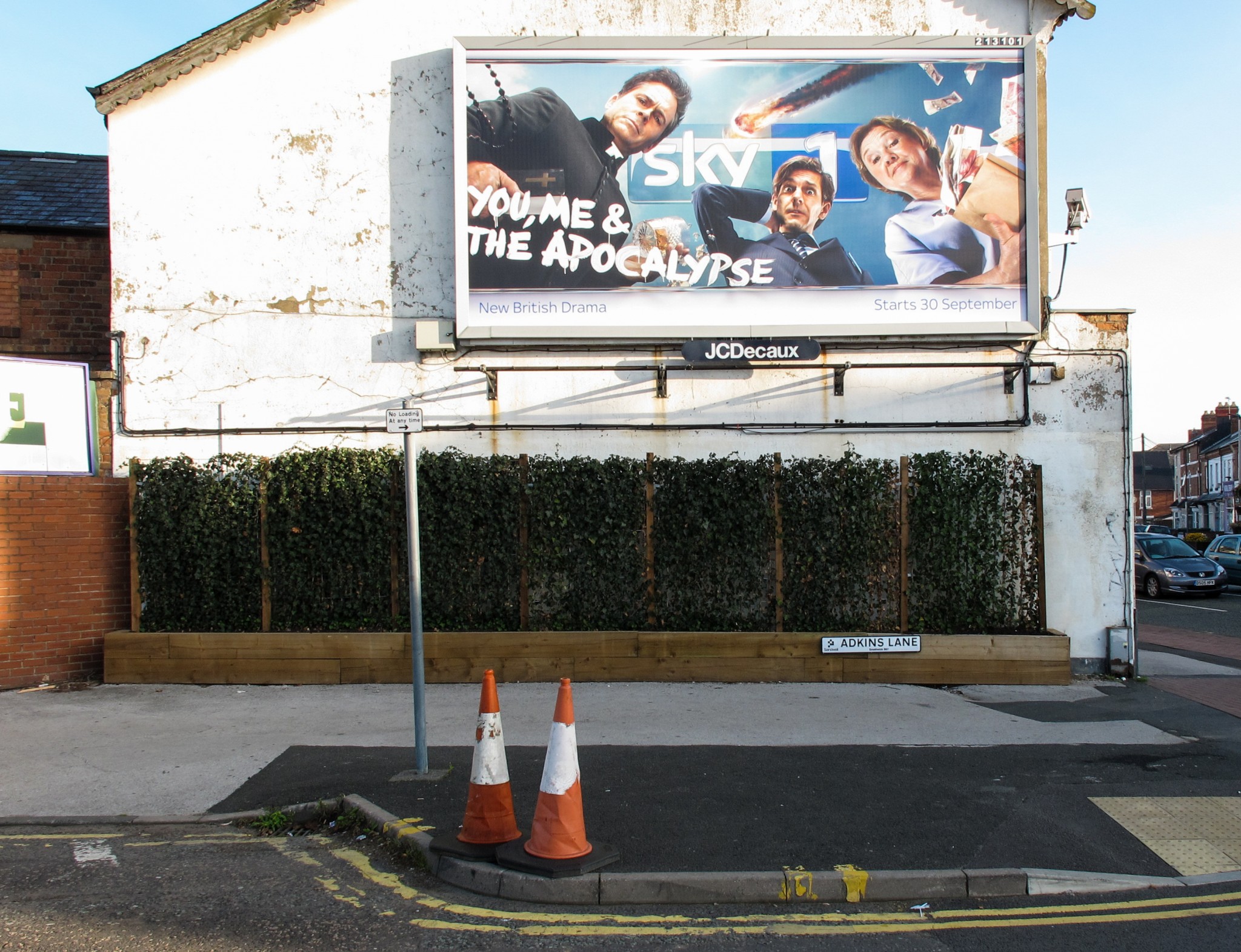
Even this solution could however be viewed by some as not right for the area, due to the loss of utility of advertising space for local businesses, but it’s probably a more calming scene despite the continued existence of official advertising space. I wonder how much bigger the name-plate for the advertising provider “JC Decaux” will increase in size over the next 10 years?
By the way it’s interesting that the current advert has something in common with the most popular prophecy about the end of the world, ie the apocalypse is likely to come from the sky.
(I’m not sure if the two traffic cones that were waiting to cross the road ever made it to the other side.)
Harvest Time
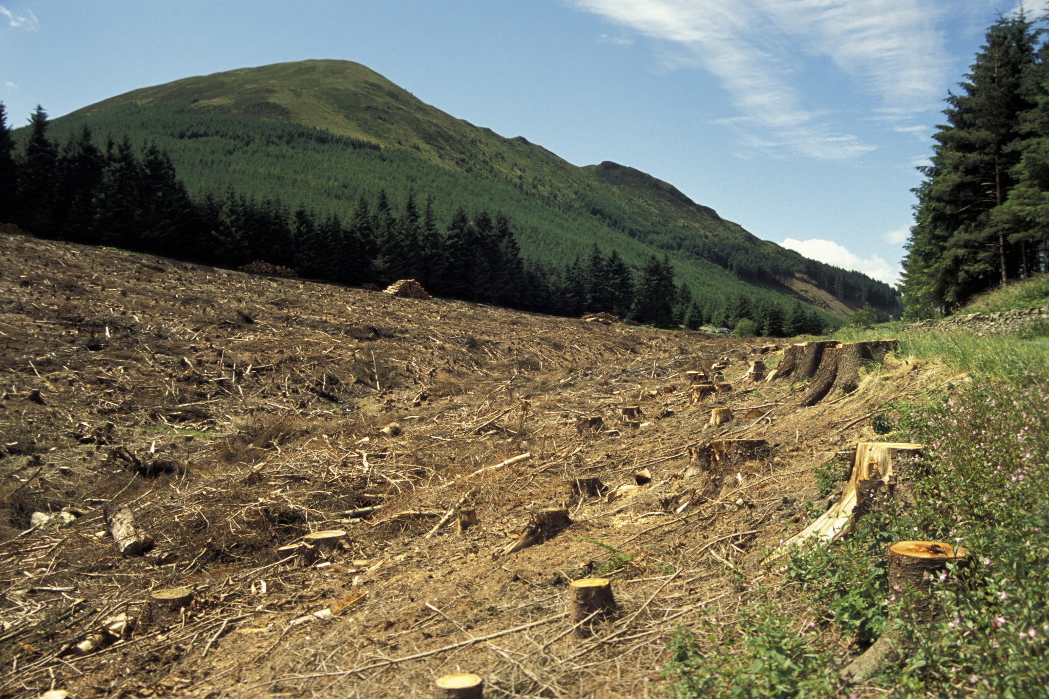
Well it’s around harvest time, so here’s the aftermath of a Lakeland tree harvest. The connection by the way is “mountains”, although the one above is less rocky and not nearly as high above sea level, but it’s roughly the same shape. Could it instead be a “hill”? What is the threshold that determines whether high ground is either termed as a hill or a mountain?
The photo was originated on slide film 15 or so years ago during a cycle trip through the Lake District, which although a national park is also a working environment…which means scars on the landscape such as this one can be found in various places. Some might ask whether or not this sort of human activity, based on a non-indigenous species of tree, is appropriate in a national park. Also, what happens to the unsightly (?) stumps which are left after tree harvesting? I’d assumed that eventually they went back to nature, thereby allowing more trees to be planted, but it seems that stump harvesting for biomass energy production is also carried out.
Whatever the situation is with tree management, the image is an example of how humans manipulate the environment to their advantage…or is it in fact the aftermath of a beavers stripping the hillside of trees to build a large dam?